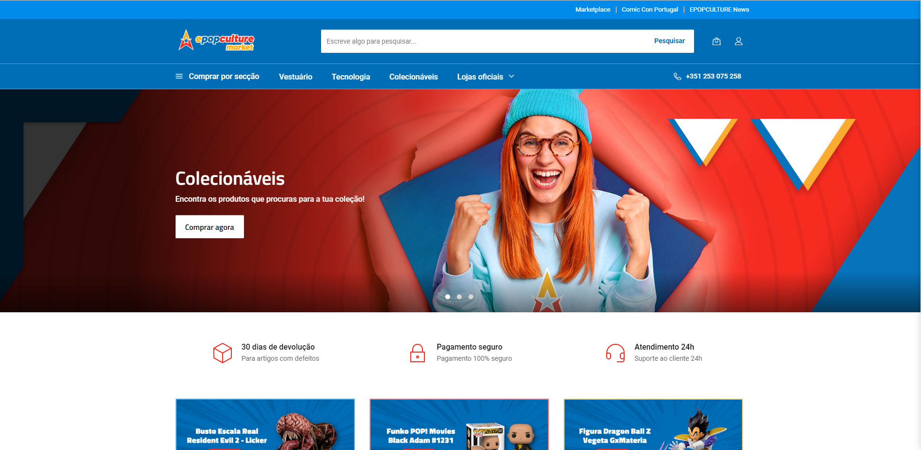
Epopculture Market - Ecommerce Website
Visual identity developed for an online Marketplace about Pop Culture products.
👁️🗨️Project Overview
TYPOLOGY ➡️ Digital Product Design
DESCRIPTION ➡️ This project marked a strategic rebranding of Epopculture’s digital presence, with the goal of aligning the marketplace more closely with its target audience. The previous website felt outdated and generic — I was brought in to completely redesign the experience, from concept to launch. Through fresh visuals, custom iconography and a user-centred layout, I helped reposition Epopculture Market as a bold, playful and accessible platform, ready to connect pop culture lovers with their favourite products.
ROLE ➡️Product Manager | Brand & Visual Designer
SOFTWARE ➡️ Adobe (Illustrator, Photoshop) | | Asana.
* * *
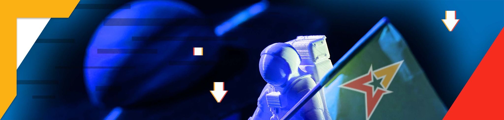
⚡The challenge was to reposition Epopculture’s retail platform through a complete visual rebranding — transforming an outdated and generic website into an engaging, user-friendly marketplace that resonates with pop culture lovers.

This required a deep understanding of the audience, a bold new digital identity, and the creation of intuitive layouts and visuals that would serve as the brand’s first impression online.
* * *
About the Brand > Epoculture
EPOCULTURE is a brand with different Market approaches: Live experiences, Content and Retail. Is most known service is the digital news channel about Pop Culture, the EpopcultureNews.
It was decided to launch the Epopculture Market aimed to be the first platform in Portugal, gathering all the favourite products about Pop Culture.
Problem Statement
How can we create a visually stunning and user-friendly online marketplace that accurately reflects the brand's identity, stands out from competitors, and drives sales, while accommodating users with disabilities and maintaining consistency across various platforms and marketing materials?
The ultimate goal of this project was to create a visually stunning, user-friendly online marketplace that enhances the brand's overall image and drives sales.
Challenges
- User Experience - ensuring that the website is user-friendly and easy to navigate.
- Brand identity - creating a design that accurately reflects the brand's identity.
- Responsive design - how the design will translate across different platforms and devices.
- Consistency - ensure that the visuals are consistent throughout the website and other marketing materials.
- Accessibility - ensure that the website is designed to accommodate users with disabilities.
✅Tasks
Used the Design Thinking approach for achieving the best solutions for this project. And I follow the steps below.
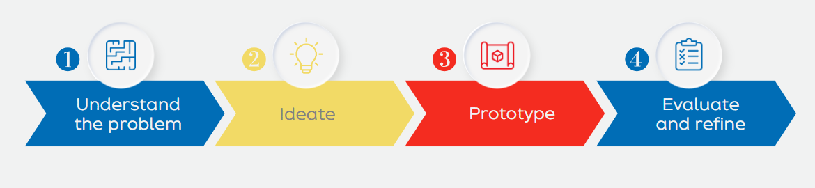
1. Understand the problem
The first step I took was a research and analysis, to identify the brand's target audience, competitors, and industry trends. With this, I gained the insights I needed to understand better the customer and identify the key design challenges to be addressed.
2. Ideate
Then I conduct an exploration stage with brainstorming, sketching, and exploring different design directions, generating ideas and concepts to develop a clear design concept that accurately reflects the brand's identity and values. I gather the colour palette, typography, content and any other visual elements that will be used throughout the website and turn them into a mood board to present the inspiration and establish a visual direction for the project.
3. Prototype
Once the design concept has been developed, I create some mockups and wireframes for the website's layout, ensuring that the visuals were engaging according to the different content areas around the website. This helped the team visualize how the website will look and function, while looking for improvement, with the iteration and feedback from the others involved in the project.
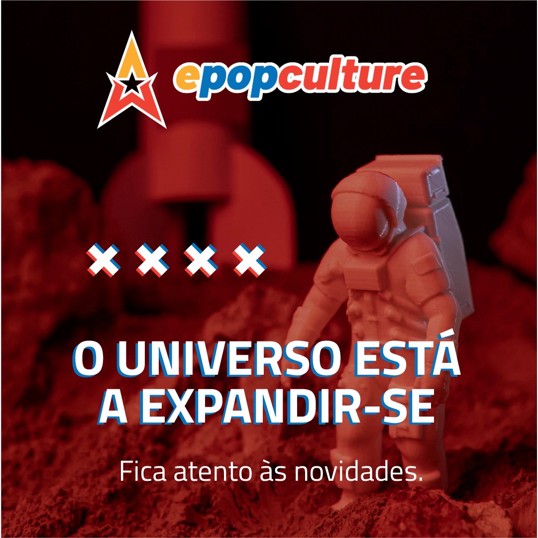
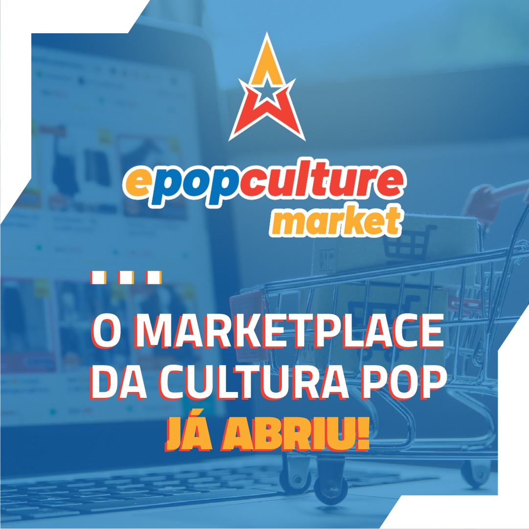
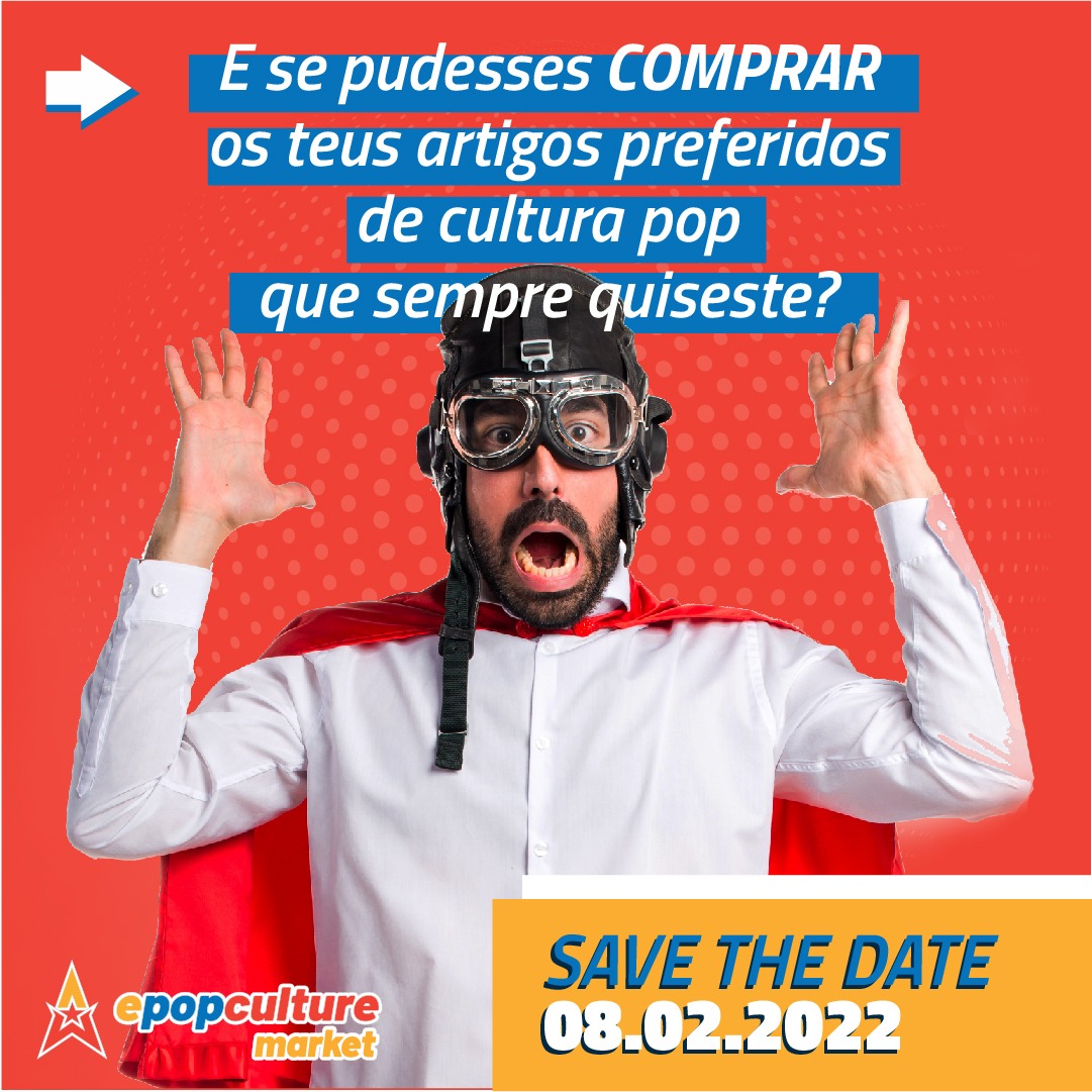
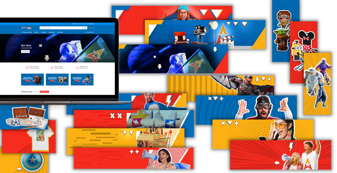
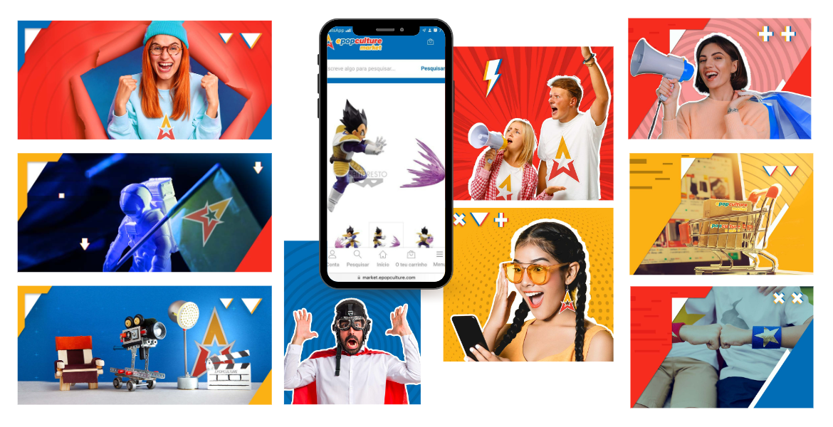
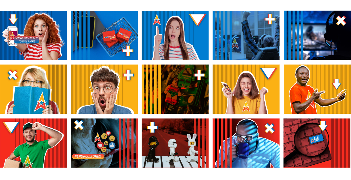
I finished developing the final visuals among the different banners, graphics and a product line for icons that would help connect the identity between the pictures, the website but also the other social platforms where the brand will be exposed, looking for consistency with the brand’s identity.
4. Evaluate and refine
In this step, the website was tested and optimized, with different users to gather less biased feedback to evaluate the effectiveness of the design, among the different visualization devices (computer, phone, tablet). Some visuals were refined and improved to better meet the needs of the customer and achieve the project goals.
The website was finally launched.
Then I also upgraded the key visual file with templates and basic rules for the regular upgrade of the pictures, especially the ones related to merchandising products, for the website and also for the other platforms where these products and brand would appear.
👩🏻🔧Actions
Then we executed the plan and completed each task in a timely and efficient manner. We had 2 months to launch the website into the market.
We played with the colour pallet of the brand identity, a pack of symbols and textures, combining them with common and informal people that would inspire desire for the products and ease of purchasing and obtaining.
🏅Results
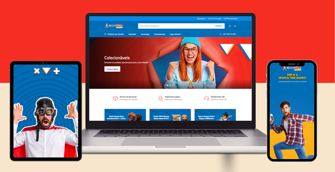
☑️ We were able to create a visually appealing and user-friendly online marketplace: that effectively attracted and engaged both new clients and new sellers.
☑️ We tailored to the needs and preferences of the target audience reflecting also the brand's identity and values, creating a design that was easy to navigate and visually engaging, were the clients could find a variety of their favourite pop culture products and the sellers could understand the value of being pictured there.
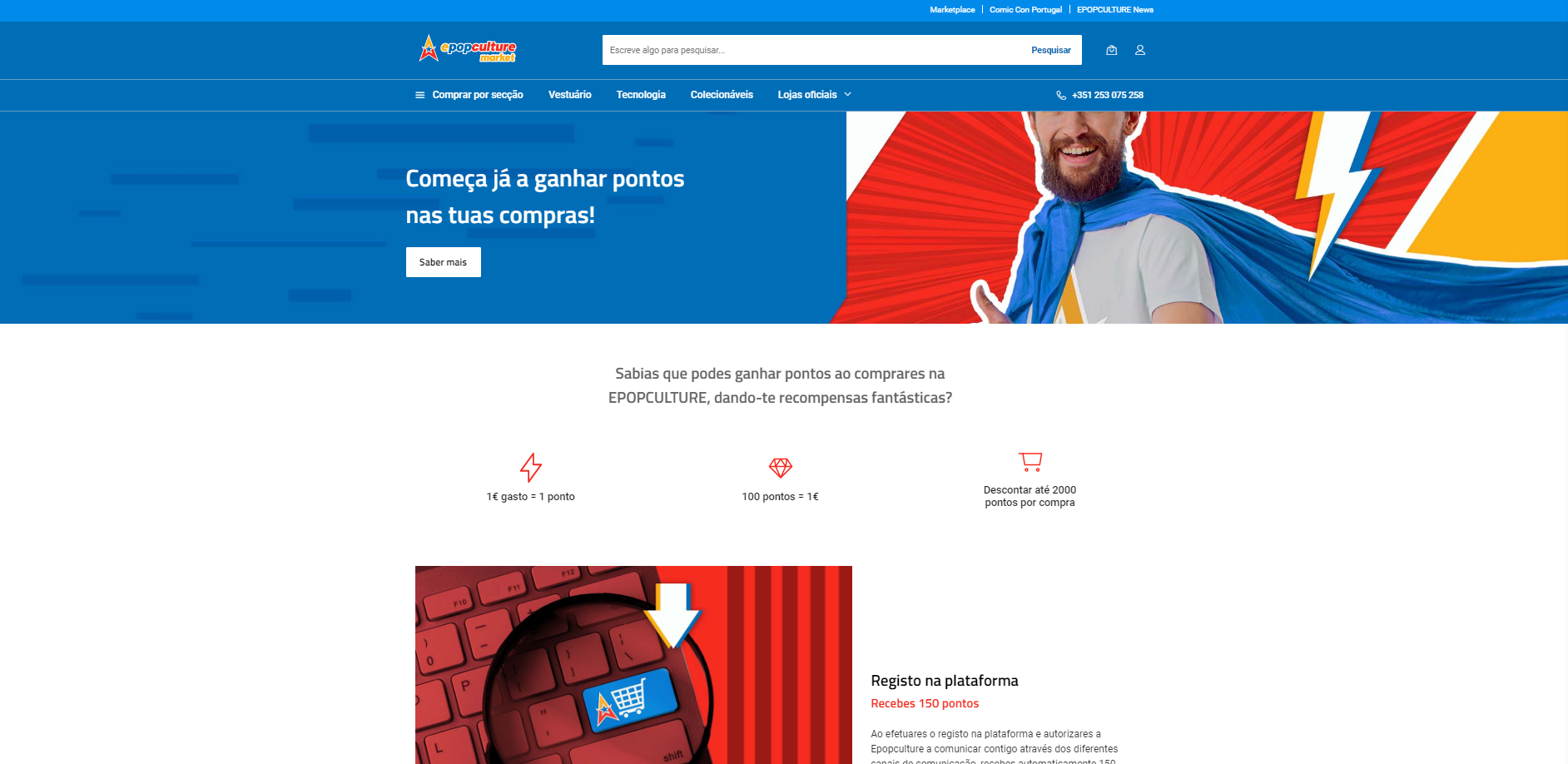
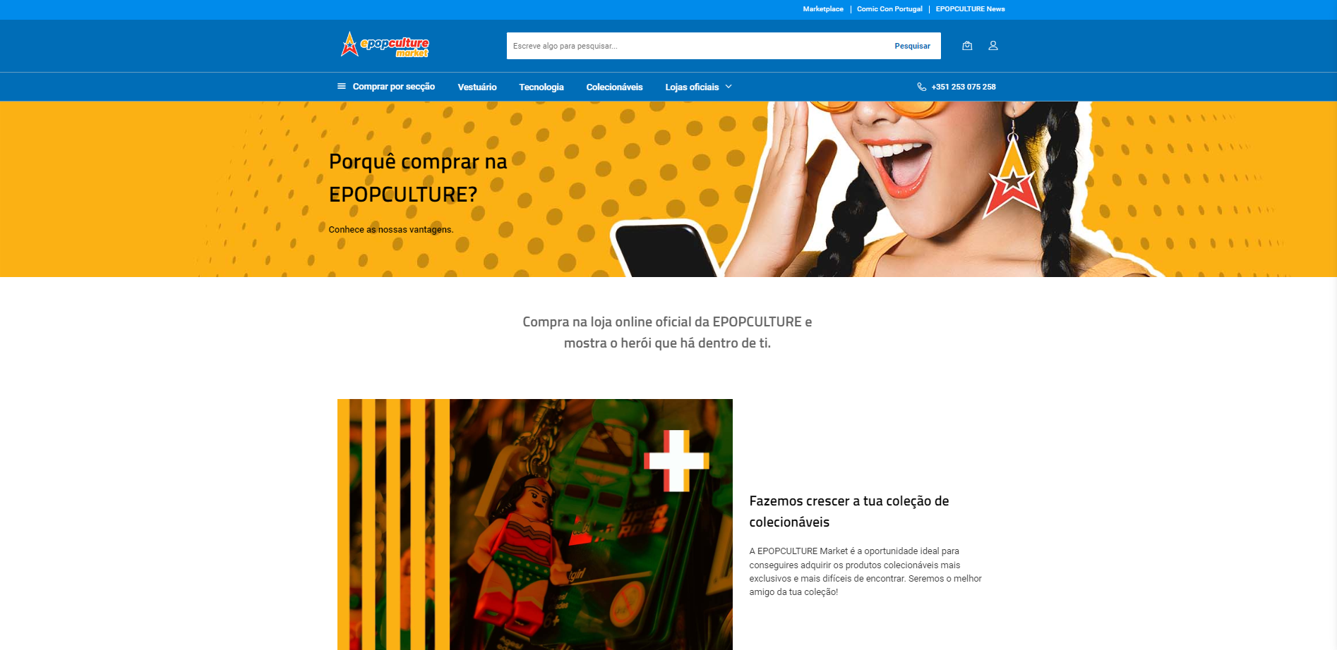
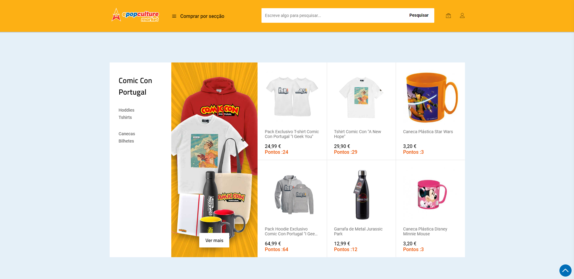
Here are some visualisations of the website interaction:
Takeaways
The goal of this project was to create visually stunning and effective visuals for an online marketplace that meet the needs of the brand and its customers, and ultimately drive traffic, sales, and engagement on the website.
With this I understand:
✅ The importance of conducting thorough research and analysis before starting any design project to gain insights into the target audience, competitors, and industry trends.
✅ The value of using mood boards to establish a clear visual direction for the project and ensure that the design accurately reflects the brand's identity and values.
✅ The benefits of using mockups and wireframes to visualize the website's layout and refine the design before executing it.
✅ The importance of maintaining a customer-centric approach throughout the design process, seeking feedback from real users, and iterating on the design as needed to ensure that it meets the needs of the brand and its customers.
✅ The need to test and optimize the website with real users to identify areas for improvement and ensure that it is effective and user-friendly.
And ultimately I could improve skills and become more effective in generating solutions for future projects.
Post a comment